Monday, December 28, 2009

Estimating black-white racial tension from 1850 to present

Previously I looked at how much attention elite whites have given to blacks since the 1870s by measuring the percent of all Harvard Crimson articles that contained the word "negro." That word stopped being used in any context after 1970, which doesn't allow us to see what's happened since then. Also, it is emotionally neutral, so while it tells us how much blacks were on the radar screen of whites, it doesn't suggest what emotions colored their conversations about race.

When tensions flare, people will start using the more charged words more frequently. The obvious counterpart to "negro" in this context is "nigger." It could be used by white racists, non-racists who are quoting or decrying white racists, by blacks trying to "re-claim" the term, by those debating whether or not the term should be used in any context, and so on. Basically, when racial tension is relatively low, these arguments don't come up as often, so the word won't appear as often.

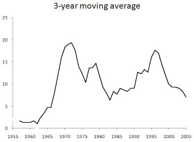
I've searched the NYT back to 1852 and plotted how prevalent "nigger" was in a given year, though smoothing the data out using 5-year moving averages (click to enlarge):


We see high values leading up and throughout the Civil War, a comparatively lower level during Reconstruction, followed by two peaks that mark "the nadir of American race relations." It doesn't change much going through the 1920s, even though this is the period of the Great Migration of blacks from the South to the West and Northeast. It falls and stays pretty low during the worst part of the Great Depression, WWII, and the first 10 years after the war. This was a period of increasing racial consciousness and integration, and the prevalence of "negro" in the Crimson was increasing during this time as well. That means that there was a greater conversation taking place, but that it wasn't nasty in tone.

However, starting in the late 1950s it moves sharply upward, reaching a peak in 1971. This is the period of the Civil Rights movement, which on an objective level was merely continuing the previous trend of greater integration and dialogue. Yet just as we'd guess from what we've studied, the subjective quality of this phase of integration was much more acrimonious. Things start to calm down throughout the '70s and mid-'80s, which our study of history wouldn't lead us to suspect, but which a casual look at popular culture would support. Not only is this a period where pop music by blacks had little of a racial angle -- that was also true of most of the R&B music of most of the '60s -- but was explicitly about putting aside differences and moving on. This is most clearly shown in the disco music scene and its re-birth a few years later during the early '80s dance and pop music scene, when Rick James, Prince, and above all Michael Jackson tried to steer the culture onto a post-racial course.

But then the late '80s usher in a resurgence of identity politics based on race, sex, and sexual orientation ("political correctness," colloquially). The peak year here is technically 1995, but that is only because of the unusual weight given to the O.J. Simpson trial and Mark Fuhrman that year. Ignoring that, the real peak year of the racial tension was 1993 according to this measure. By the late '90s, the level has started to plummet, and the 2000s have been -- or should I say were -- relatively free of racial tension, a point I've made for awhile but that bears repeating since it's not commonly discussed.

Many people mention Obama's election, but that was pretty late in the stage. Think back to Hurricane Katrina and Kanye West trying but failing to foment another round of L.A. riots, or Al Sharpton trying but failing to turn the Jena Six into a civil rights cause celebre, or the mainstream media trying but failing to turn the Duke lacross hoax into a fact that would show how evil white people still are. We shouldn't be distracted by minor exceptions like right-thinking people casting out James Watson because that was an entirely elite and academic affair. It didn't set the entire country on fire. The same is true for the minor exception of Larry Summers being driven out of Harvard, which happened during a remarkably feminism-free time.

Indeed, it's hard to recognize the good times when they're happening -- unless they're fantastically good -- because losses loom larger than gains in our minds. Clearly racial tensions continue to go through cycles, no matter how much objective progress is made in improving the status of blacks relative to whites. Thus, we cannot expect further objective improvements to prevent another wave of racial tension.

Aside from the long mid-20th C hiatus, there are apparently 25 year distances between peaks, which is about one human generation. If the near future is like most of the past, we predict another peak around 2018, a prediction I've made before using similar reasoning about the length of time separating the general social hysterias that we've had -- although in those cases, just going back to perhaps the 1920s or 1900s, not all the way back to the 1850s. Still, right now we're in a fairly calm phase and we should enjoy it while it lasts. If you feel the urge to keep quiet on any sort of racial issues, you should err on the side of being more vocal for right now, since the mob isn't predicted to come out for another 5 years or so, and the peak not until 10 years from now. As a rough guide to which way the racial wind is blowing, simply ask yourself, "Does it feel like it did after Rodney King and the L.A. riots, or after the O.J. verdict?" If not, things aren't that bad.

Looking at absolute levels may be somewhat inaccurate -- maybe all that counts is where the upswings and downswings are. So I've also plotted the year-over-year percent change in how prevalent "nigger" is, though this time using 10-year moving averages to smooth the data out because yearly flucuations up or down are even more volatile than the underlying signal. In this graph, positive values mean the trend was moving upward, negative values mean it was moving downward, and values close to 0 mean it was staying fairly steady:


Again we see sustained positive growth during the Civil War, the two bookends of the nadir of race relations, although we now see a small amount of growth during the Harlem Renaissance era. The Civil Rights period jumps out the most. Here, the growth begins in the mid-1940s, but remember that it was at its lowest absolute levels then, so even the modest increases that began then show up as large percent increases. The PC era of the late '80s through the mid '90s also clearly shows up. There are several periods of relative stasis, but I see three periods of decisively moving against a nasty and bitter tone in our racial conversations: Reconstruction after the Civil War (admittedly not very long or very deep), the late '30s through WWII, and the "these are the good times" / Prince / Michael Jackson era of the mid-late '70s through the mid '80s, which is the most pronounced of all.

That trend also showed up television, when black-oriented sitcoms were incredibly popular. During the 1974-'75 season, 3 of the top 10 TV shows were Good Times, Sanford and Son, and The Jeffersons. The last of those that were national hits, at least as far as I recall, were The Cosby Show, A Different World, Family Matters, The Fresh Prince of Bel-Air, and In Living Color, which were most popular in the late '80s and early '90s. Diff'rent Strokes spans this period perfectly in theme and in time, featuring an integrated cast (and not in the form of a "token black guy") and lasting from 1978 to 1986. The PC movement and its aftermath pretty much killed off the widely appealing black sitcom, although after a quick search, I see that Disney had a top-rated show called That's So Raven in the middle of the tension-free 2000s. But it's hard to think of black-focused shows from the mid-'90s through the early 2000s that were as popular as Good Times or The Cosby Show.

But enough about TV. The point is simply that the academic material we're taught in school usually doesn't take into account what's popular on the radio or TV -- the people's culture only counts if they wrote songs about walking the picket line, showed that women too can be mechanics, or that we shall overcome. Historians, and people generally, are biased to see things as bad and getting worse, so they rarely notice when things were pretty good. But some aspects of popular culture can shed light on what was really going on because its producers are not academics with an axe to grind but entrepreneurs who need to know their audience and stay in touch with the times.

Saturday, December 19, 2009

Brief: When were the most critically praised albums released?

To follow up on a previous post about when the best songs were released (according to Rolling Stone), here are some data from the website Best Ever Albums. They've taken 500 albums that appear on numerous lists of "best albums ever," which is better than using one source alone. If an album appears on 30 separate such lists, that indicates pretty widespread agreement. Here is how these top-ranking albums are distributed across time:


Music critics clearly prefer the more counter-cultural albums of the late '60s and early '70s, as well as those of the mid-'90s, although they do give credit to the more mainstream hard rock albums of the late '70s. It's not surprising that the 1980s don't do as well -- the nadir coincides with New Wave music -- since their appeal was too popular and upbeat -- and we all know that great art must be angry or cynical or weird. That may be somewhat true for high art, but when it comes to popular art like rock music or movies, I think the critics inappropriately imitate critics of high art. Sgt. Pepper's Lonely Hearts Club Band is not high art -- sorry.

Within the bounds of what pop music can hope to accomplish, I think the late '70s through the early '90s -- and to a lesser degree, the early-mid 1960s -- did the best. The later Beatles, Nirvana, etc., to me seem too self-conscious to count as the greater and deeper art forms that they were aspiring to.

Still, whether or not the critics are on the right path, these data show a remarkable consensus on their part -- otherwise, one person's list would hardly overlap with another's. I would say that appreciation of art forms is not arbitrary, just that -- in this case -- they reach agreement in the wrong direction!

Tuesday, December 15, 2009

Brief: Is the "culture of fear" irrational?

We hear a lot about how paranoid Americans are about certain things -- people in the middle of nowhere fearing that they could be the next target of a terrorist attack, consumers suspicious of everything they eat because they heard a news story about it causing cancer, and so on.

Of course, we could be overreacting to the magnitude of the problem, as when we panic about a scenario that has a 1 in a trillion chance of occurring but that sounds disastrous if it did happen. It's not clear, though, what the "appropriate" level of concern should be for a disaster of a given magnitude and chance of happening. So the charge of irrationality is harder to level using this argument about a single event.

But we also get comparisons of risk between events wrong, for example when we fear traveling by airplane more than traveling by car, even though planes are safer. Here the case for irrationality is straightforward: for a given level of disaster (say, breaking your arm, dying, or whatever), we should panic more about the more probable ways that it can occur. The plane vs. car example makes us look irrational.

Still, there's another way we could measure how sensible our response is, only instead of comparing two sources of danger at the same point in time, comparing the same source of danger at different points in time. That is, for a given level of disaster, any change in the probability of it happening over time should cause us to adjust our level of concern accordingly. If dying in a plane crash becomes less and less likely over time, people should become less and less afraid of flying. When I looked into this before, I found that the NYT's coverage of murder and rape has become increasing out-of-touch with reality: while the crime statistics show the murder and rape rates falling after the early 1990s, the NYT devoted more and more of its articles to these crimes. So at least at the Newspaper of Record, they were responding irrationally to danger.

But what about the average American -- maybe the NYT responds in the opposite way that we might expect because when violent crime is high, people see and hear about plenty of awful things outside of the media, so that writing tons of articles about murder and rape wouldn't draw in lots more readers. In contrast, when the society becomes safer and safer, an article about murder or rape is suddenly shocking -- just when you thought things were safe! -- and so draws more readers, who start to doubt their declining concern about violence.

The General Social Survey asks people whether there's any area within a mile of their house where they're afraid to go out at night. Here is a plot of the percent of people who say that they are afraid to go out at night, along with the homicide rate for that year:


Clearly there is a tight fit between people's perception of danger and the reality underlying that fear. The Spearman rank correlation between the two within a given year is +0.74. That's assuming that people respond very quickly to changes in violence; it might be even higher because there appears to be somewhat of a lag between a change in the homicide rate and an appropriate change in the level of fear. For example, the homicide rate starts to decline steadily after a peak in 1991, but people's fear doesn't peak until two years later, when it too steadily declines. That makes sense: even if you read the crime statistics, those don't come out until two years later. To respond right away, you'd have to be involved in the collection and analysis of those data. The delay is more likely due to people hearing through word-of-mouth that things are getting better -- or not getting negative word-of-mouth reports -- and that it takes awhile for this information to spread throughout people's social network.

Putting all of the data together presents a mixed picture on how rational or irrational our response to the risk of danger is. But here is one solid piece that average people -- not those with an incentive to misrepresent reality, either in a more negative or more positive way -- do respond rationally to risk.

GSS variables used: fear, year

Monday, December 14, 2009

Programming note

I got an email asking if late-semester work is piling on, but I'm actually just waiting until the year ends in order to round out a lot of posts with time series in them. I want to make sure I get all of the 2009 data in. So I'll probably post briefer items until the beginning of the new year, at which point there will be a glut of meatier posts. As always, feel free to leave requests in the comments.

Brief: Which Western countries care most about preserving the media?

A recent NYT article reviews a German study of how willing people in various countries are to pay for "online content" -- news reporting, videos, songs, etc. In the German-language PDF linked to above, a table shows how people in the countries studied describe their preferences for getting online content. The columns read: free with ads, free with no ads, pay with no ads, pay with ads, and none of above. You can probably figure out what the country names are.

There's a fair amount of variation in how much of the population is willing to pay at all, or conditional on paying or not paying, whether they'll accept advertising. To see what explains this, I've excluded people who answered "none of the above," leaving only those who expressed an opinion. In the table below, I've lumped the two "free" groups together and the two "pay" groups together. I've also calculated a "delusional" index, which answers the question, "Of those who want free content, what percent expect it to not even have advertising?" Obviously someone has to pay for news articles to get written, and some free-preferers recognize that advertising is the only viable alternative to not paying for typical media products yourself. So, those who answer "free, no ads" are expecting media producers to behave like charities.

The table also shows GDP (PPP) per capita, on the hunch that richer countries will be more willing to pay for news, videos, and so on. In economics jargon, this online content is a "normal good" that sees a rise in demand when a population gets wealthier (an "income effect" pushes the demand curve up). The table is ordered from most to least willing to pay.

Country GDP / cap % Pay Delusional
Sweden 37,334 25 20
Netherlands 40,558 20 36
Great Britain 36,358 19 43
USA 47,440 18 27
Belgium 36,416 15 33
Italy 30,631 15 46
Greece 30,681 13 27
Bulgaria 12,322 12 41
Czech 25,118 11 56
Germany 35,539 10 56
Turkey 13,139 9 54
Romania 12,600 9 48
France 34,205 8 56
Portugal 22,232 8 52
Hungary 19,553 8 52
Spain 30,589 6 61
Poland 17,537 5 57


It sure looks like wealth plays a key role, so let's look at how GDP relates to both willingness to pay and how delusional the free-preferers are:


Since the willingness to pay and the delusional index cannot vary outside of the range [0,1], I use the Spearman rank correlation instead of the Pearson correlation. The correlation between GDP and the percent willing to pay is +0.67 (two-tailed p less than 0.01). Between GDP and the delusional index, it is -0.49 (two-tailed p = 0.05). People in richer countries are more willing to pay, and they are less deluded about where stuff comes from -- that is, typically not from charities.

The surprises are worth looking at. At the top, we see mostly Anglo and Nordic countries, and at the bottom the more southern and eastern parts of Europe. However, France ranks pretty low, and Germany doesn't do much better, even though we Americans think of those countries as having more sophisticated media tastes, and as treasuring the institutions of the media -- Gutenberg in Germany, for example. We also think of ourselves as much more bratty when it comes to the media -- that because our sophistication level is so low, we're only a tiny bit willing to pay, and any more than that we'll junk the news in favor of some other cheap form of entertainment.

It looks like the ones that have more pro-market views are more supportive of paying for online content. The French and Germans may like the idea of keeping the media alive and thriving, but Americans are more willing to do what it takes to ensure that happens.

Wednesday, November 11, 2009

Brief: When statesmen weren't elderly

A book that I'm reading casually mentioned that the English politician Bolingbroke became Secretary at War in 1704 -- at age 26. When something seems like it's from another world, it probably reflects the massive changes that the West has seen since making the transition to a society characterized by open entry and competition in both the economic and political spheres. To check this, I've plotted over time how old the entering British Secretary at War was (or whatever new title he may have had, such as Secretary of State for Defence). Here are the results:


Sure enough, up through the first quarter of the 18th C., the Secretary at War's age hovers around 30. By the end of the century, his age has moved to the upper 30s and 40s. During the 19th C. there is more variance, with a handful of Secretaries in their early 30s, but the trend is still upward into the 40s and 50s. After 1900, the youngest has been 38, the oldest 73, with the average at 52. The men with heavy war responsibilities are about 20 years older in post-industrial than in pre-industrial times.

One reason may be that everyone started living longer with industrialization, not just the statesmen. But when you think about it, that cannot explain things. Presumably the 17th C. counterparts of today's lead singers of a rock band were also in their 20s. Elite athletes were likely also in their 20s, as they are today. If there were supermodels back then, you can bet they would have been in their 20s as well. Instead, there has been a shift in what type of people are considered fit for war secretary, which in turn reflects a change in the job description itself.

Violence and Social Orders, the book I'm reading, posits a framework for understanding history through the lens of controlling violence. In a primitive social order, such as those of hunter-gatherers, there is continual violence, no state, and mostly no social organizations beyond kin networks.

The limited access order (or "natural state") controls violence by using the state to create rents for elite members of a dominant coalition. Each elite gets his own piece of turf to extract rents from, and each elite respects the turf of the others because otherwise violence will break out, and that disorder would destroy the rent-creation. To make sure that the rents are sufficient to persuade elite members to refrain from violence, access to the elite is restricted -- if it were open, lots of people would pour in and shrink the amount of the rents going to each person. Still, the shadow of violence always looms over the society, since the means of violence are spread out over the entire elite -- not monopolized by the state -- and they only refrain as long as no one trespasses against them. The threat is always there.

Open access orders are the ones we live in today, where there is political control of the military, the state is used to provide public goods for the masses rather than private rents for the elites, and where the economically powerful earn their money through profits -- doing something productive -- rather than parasitizing rents from the peasants under their control. Violence is rare because the state monopolizes the legitimate use of violence, rather than every elite member being a violence specialist himself or closely allied with one. Elites compete on the basis of the price and quality of the goods and services they provide -- not based on who can defeat whom in a violent battle.

My guess for why open access orders have older statesmen is that since the shadow of violence has been largely removed, you don't need people running military affairs who are itching to pick up arms and go kick some ass. Being a hormone-crazed young person is great in a natural state -- your hair-trigger emotions are suited to a world where you always have to be prepared to fight, and your choleric temper provides a credible threat to would-be trespassers during peacetime. For example, Alexander the Great became King of Macedon at 20 and had conquered much of the known world by his death at 32.

But in open access orders, violence has been stripped from the broad elite and concentrated in the state, and civil war -- that is, intra-elite war -- is rare. So, too, are elite uprisings against the state -- before, these resulted from elites losing their rents and going after the people who were supposed to be providing them. So in these societies hot-headed young people are only going to threaten the peace. The elites are no longer constantly prepared to battle each other, so we only require a calm person to make sure everyone continues to get along. A 26 year-old in charge of the army, by contrast, would grow bored with peace so quickly that he'd want to stir things up "so we at least have something to do."

It's funny that we worry today about how to control young males' violent impulses, which threaten the peace. Only 300 years ago, we would have been grateful to have a young violent male in our social circle -- he would've been extracting rents from us, but at least we'd have someone to protect us from all those other specialists in violence. We truly live in a different world.

Tuesday, November 10, 2009

Brief: How does racial ideology vary by income level for blacks and whites?

One school of thought says that ideology is something that the poor are more likely than the rich to rely on -- e.g., Marx's view that religion is the opiate of the masses -- while another holds that ideology is costly, so that the wealthier you are the more you can indulge in it. Let's see how this works out with the ideology of racial consciousness among blacks and whites as a function of income.

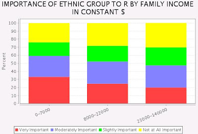
The General Social Survey asks how important ethnic group membership is to your sense of who you are. Here is how whites (1st) and blacks (2nd) respond, split up into the upper, middle, and lower thirds of the black income distribution:


As whites become richer, they rely less and less on their ethnicity to define themselves, while the opposite is true for blacks. Blacks of all income groups are more likely than whites to be highly racially conscious (i.e. by answering "very important"), but this gap widens as we move up the income scale -- from about 30 percentage points among the poorest third to over 50 percentage points among the richest third. There is greater race polarization among the rich than among the poor, which rules in favor of the idea that ideology is costly and so that the rich consume more of it than the poor. (Wealthy whites do not consume pro-white ideology but rather an ideological form of cosmopolitanism.)

This result is similar to the Republican - Democrat gap that widens as you move up the income scale, as shown by Andrew Gelman and colleagues in Red State, Blue State, Rich State, Poor State. They come to the same conclusion that arguing over Starbucks, gas-guzzling SUVs, etc., is due to post-materialism -- something you indulge in after your basic financial needs are well taken care of.

Another question asks if you believe harmony in the US is best achieved by down playing or ignoring racial differences. This is the Rodney King view, the opposite of the Malcolm X view. Here are the results for whites (1st) and blacks (2nd):


Whites feel virtually the same across income groups, while richer blacks are less likely to agree with the Rodney King view and more likely to stand strongly against it. Again we see greater race polarization as we look at higher-earning people, which reinforces the post-materialist take on how and why ideology varies across income levels.

GSS variables used: ethimp, ethignor, race, realinc

Monday, November 9, 2009

Brief: Generational views of communism

On the 20th anniversary of the fall of the Berlin Wall, let's take a look at how the various generations viewed communism.

The General Social Survey asked a question from the early 1970s through the mid-1990s about your view of communism. I've restricted the respondents to those between the ages of 18 and 30 to make sure that we're looking at those most prone to idealistic foolishness of one stripe or another. The generations I've chosen are earlier Baby Boomers, later Baby Boomers, the disco-punk generation (perhaps Second Silent Generation is better), earlier Generation X-ers, and later Generation X-ers. Here are the results:


I knew beforehand that those born between the two most recent loudmouth generations (Boomers and X-ers) would be the least sympathetic to commies because they came of age during a decidedly non-ideological period -- roughly the late '70s and early '80s, in contrast to the highly ideological Sixties and early '90s that the other two generations grew up during. Young people during the social hysterias felt compelled to embrace the larger world in order to change it for the better, while young people during a period of relative social calm felt like telling the larger world to go get a life of its own, leave us alone, and let us have fun.

I'm putting together a more detailed post about generational differences in voting patterns across the years, so stay tuned.

Sunday, November 1, 2009

Brief: Too smart for their own good or just showing off?

Returning to the theme of whether people favor policies that benefit their narrow self-interests, let's have a quick look at who says the government should provide a minimum income. The self-interest view says that as people make more money, they should be less likely to favor such a policy -- they earn too much to qualify, and they'd pay for it through higher taxes. Indeed, that's just what the GSS shows, whether we look at real income or self-described class. Here are the results, where red is support, blue is neutral, and green is reject:


But what about support for the policy based on your brains? The self-interest view predicts the same pattern as above -- college graduates are very unlikely to qualify, yet they'd have to pay higher taxes to fund it. And in the GSS, real income increases steadily as your intelligence increases (data not shown here), so we'd expect smarter people -- who are also wealthier people -- to want the policy less. That's mostly true, except at the very high end:


Support for a minimum income policy decreases as you poll smarter and smarter people -- until you reach the high end, who get 9 or 10 out of 10 questions correct on a makeshift IQ test. Similarly, support erodes as you poll more and more educated people -- until you reach the high end, who have more than 2 years of post-graduate study (i.e., not just a masters but a doctorate).

You might think that overly brainy or overly educated people make less than those just below them -- think of the English PhD who works at Starbucks -- but remember that using this measure of IQ, the upper end makes more money than those just below them. You might also think that the high end has simply been exposed to more silly ideas -- again, think of the English PhD who had to read some Marxist stuff for his theory classes -- but why doesn't this hold for those with 1-2 years of college, 3-4 years of college, or who hold a masters? Surely they've been more exposed to silly ideas than those just below them, and yet they are less and less likely to support the policy. And remember that the reversal also shows up in IQ, which just measures how smart you are, rather than how much time you've spent listening to professors.

So perhaps there is something to the idea of people at the upper end of the intelligence scale being "too smart for their own good." Minimum income policies will keep more poor and low-skilled people out of work because an artificially high price (i.e., a wage or salary higher than what employers and workers would agree to) means that employers won't offer as many jobs as they would if the wages were somewhat lower. As people have more intelligence to see this -- or at least sense it intuitively -- support for the policy generally drops off. But maybe being at the upper end makes people arrogant -- "Well, that's the obvious answer, so it can't be right. There has to be a more complicated and different answer!"

Alternatively, the high end could be trying to signal their braininess -- "I'm so smart that I can hold all sorts of ridiculous views and not suffer any consequences." Why don't people on the high end of income and class try to signal their status in the same way? Because income and class are more acquired traits, whereas differences in intelligence in modern societies mostly reflect different genetic endowments. If you're trying to signal how good your genes are, the trait that you claim to be so high on -- "I'm so X that I can afford to..." -- would have to show a strong genetic influence.

These data don't allow us to decide between the two main explanations, but they do rule out the strong version of the self-interest view.

GSS variables used: govminc, realinc, class, educ, wordsum

Sunday, October 25, 2009

Diversity in aesthetic tastes over the last 130 years: Evidence from names

Updated

Virginia Postrel argues in The Substance of Style that we have entered a new aesthetic age, where design objects are available to a mass audience, where those consumers no longer consider just the price but also the look and feel of the stuff they buy, and so where producers don't compete with each other only on price but also on how aesthetically pleasing their products are. (Think of how many stylish toilet brushes you can buy at Wal-Mart or Target.)

She wrote this in 2003 and claims it began sometime in the mid-to-late 1990s. That trend seemed to take off even more during the recent financial euphoria, and although it's surely taking a beating during the recession, it'll be back once we feel safe spending again.

One thing I kept asking myself was, "Is this really so new?" As a general rule, you should be skeptical of all stories about how we're "entering a new age." After all, what about the 1920s and '30s, which Postrel admits could have been a previous age of aesthetics? She counters that design wasn't enjoyed by nearly as large a fraction of the population as it is today, and that the range of products that were designed with aesthetics in mind also was more limited than today. What about the more mass-market design of the 1950s and '60s? She says that the choices available weren't nearly as varied and driven by customization as the ones we have today.

I've decided to take a different approach by looking at baby names, a program pioneered by Stanley Lieberson to investigate fashions (summarized in his excellent book A Matter of Taste). Unlike toilet brushes, cars, or paintings, names you give your baby don't cost money. They carry non-monetary costs -- you wouldn't name your kid Adolf, and it's not because you'd have to plunk down big bucks to register that name. Still, they are a lot closer to the ideal test of someone's desires where you ask them to "pretend that price isn't an issue."

Postrel sees the choice to endow an object with aesthetic qualities as "making it special." That has two consequences: it will tend to create turnover, as people start to make things special by making them different from what they were like yesterday; and it will tend to make things more diverse, as individuals try to look different from each other today. Lieberson has already provided graphs from many European countries on the turnover in names over time, going back centuries. The take-home message is that roughly before the industrial era, there was little to no turnover in names. (He measures turnover as the number of names in this year's Top 10 that were not present in last year's Top 10.) With industrialization, the fashion in names took off. The turnover rate really shoots up sometime in the mid-20th C., but it's not clear if it's something different or just the rapid-growth phase of a single, sustained exponential increase.

That's not too surprising, and it underscores the importance of not believing in "new era" stories. To a first approximation, there was the transition to agriculture, and then the transition to industrial capitalism -- and that's it. That's basically all we see in Lieberson's turnover data -- there is a pre-industrial stage with no turnover and an industrial stage with high turnover, and that's about all.

What about the diversity of names? Even if there were no turnover in the Top 10 names, we could still see people introducing more and more new names in order to make their children special. Recall that a big part of Postrel's story is that in our new aesthetic age, we really value standing out from others at the same point in time, not simply moving from one universal style to another over time. Lieberson does have some graphs on how highly concentrated names are, but the data are much more regional than national, they only cover some of the 20th C (although a decent chunk of it), and the measure isn't as precise as it could be. (He uses the percent of all names that are held by the Top 20 names, as well as the percent of all names that are given to only one person.) The rough pattern is that diversity of names seems somewhat static from roughly 1920 through either 1945 or 1960, and by no later than 1960 we see a tendency toward greater diversity.

To solve these problems somewhat, I turn to the Social Security Administration's archive of popular baby names. These are national data, so the sample size is a lot larger than Lieberson's regional data, and the regional differences are smoothed out. They also cover more time -- 1880 to 2008. And I've used a more standard measure of variation when the data are not quantitative (like names), as well as develop a measure of my own that is more flexible.

The standard measure I use is one of many ways to measure "qualitative variation," where the data are not numbers. It is thus impossible to compute how far a given datum deviates from the mean, and thus impossible to compute the variance. For data that are numbers -- height, IQ, etc. -- the variance tells us how spread out vs. how similar the values are. In the Appendix, I discuss what the two measures I use are, the standard one and my own. The only thing you need to know is that bigger values mean greater diversity.

With that out of the way, let's see what the historical pattern of conformity vs. diversity has been in aesthetic tastes. There are separate data for males and females, so I also show what the female - male gap has been:


First, note that the female line is always above the male line, a pattern that shows up in Lieberson's turnover data too. Parents give greater fashionableness to their daughters' names, and are less enthusiastic about their sons standing out.

There certainly has been a sharp increase during the past generation, starting around 1983 for boys and 1987 for girls. But that's nothing new. There was a more modest upturn from just after WWII until the early-mid 1980s. Moreover, there was another pronounced increase going back at least to 1880 (and probably before -- remember that the turnover data tracked industrialization), which fizzled out around 1905 for girls and 1910 for boys. From then until the post-WWII era, diversity actually stagnated or slightly declined. This trend obviously goes against what we'd expect from our view of the 1920s and '30s as a previous age of aesthetics. At least in the sense of "making special" as distinguishing things from one another in the same time period, the turn-of-the-century through the post-WWII era was conformist compared to the dizzying changes of the earlier industrializing stage or the turbulence that would follow.

In looking at the female - male gap, we are looking at another facet of culture -- namely, how egalitarian-minded people were with respect to sex (and perhaps in general). We see a narrowing of the gap from at least as far back as 1880 until 1915. From then until 1969, we see a general widening of the gap, although there are noticeable egalitarian dips during the depth of the Great Depression in the early-mid 1930s and during WWII. From 1915 until WWII, the widening gap is caused by boys receiving more similar names, with little change among girls. To me, that suggests traditionalism -- don't make girls' names any more fashionable, and drive boys names away from being fashion symbols.

From WWII to 1969, though -- i.e., during the Baby Boom -- the widening gap is caused by girls receiving more diverse names at a faster rate than boys are. This is a compromise between tradition and change -- clearly it's a break with the traditional values by making boys names more subject to fashion, but you don't notice it so much because girls' names are becoming even more subject to fashion.

Once the earliest Baby Boomers (born around 1945) reach child-bearing age (around 25), or in 1970, we see a steady reversal. Boomers wanted to equalize the outcomes of their own babies, and this was mostly due to slowing down the fashionableness of girls' names. That's what they tried elsewhere -- recognizing that females are more compliant than males, you should force females to be more like males rather than vice versa. Boomers were more likely to favor "bring your daughter to work day" than "give your son a dollhouse to play with."

There is a brief widening of the gap from 1987 to 1996, and this corresponds to the generation I've elsewhere called the disco-punk generation. They are too young to be canonical Boomers and too old to be Generation X-ers. I've estimated that they were born between about 1958 and 1964, so the typical member born in the early '60s would have started having kids in the late 1980s. This generation is very different from Boomers and X-ers, not having been ideological or attention-whoring when they were coming of age around 1980.

However, once the prototypical Gen X-er, born in 1971, starts having kids in 1997, the gap starts to close again. Remember, they were the ones who made Third Wave feminism a success.

So, the female - male gap shows us that our aesthetic preferences reflect larger social and cultural changes, such as how ideological we are about sex equality.

Even the overall data, which don't show such sensitivity to smaller-scale social changes, still reflect social change, although at a much larger level. The industrializing and globalizing stage was completed around the turn of the century. The change in the connectedness of the global economy was far greater from 1830 to 1920 than from 1920 to today. And most of the major innovations that came with industrialization were in place by then too. Those allowed design objects to reach a wider market, as well as greater customization with each passing year. We see this saturation of the industrial trends by the flat lines from roughly 1910 to 1945.

After WWII, we did start another round of changes away from manufacturing and toward services, and toward consumption of more "frivolous" goods and services than more basic ones, as the former became cheaper. What Postrel calls the new age of aesthetics really began in the mid-1980s, perhaps reflecting our greater taste for fashion items as we began to borrow more to buy more.

To conclude, we've found hard data showing that Postrel's hunch was right about the last generation being more and more aesthetically minded. But contrary to her "first time ever" theme, there was fantastic change during the industrializing stage too. Unfortunately the data don't go back to the beginning of that stage, which would probably show the trend even more clearly. But like I said before, that's the expected picture -- there's the shift to agriculture and the shift to industrial capitalism, and the rest are just hiccups.

Update: The historical pattern of rising diversity from the late 19th C through WWI, a stagnation or slight decline from then until WWII, and then another stage of sharp increase, mirrors the pattern of American openness to international trade. We became more integrated from the late 19th C through WWI, became more isolationist and protectionist from then until WWII, and then began reducing barriers to global trade. Perhaps there is some abstract "openness to differences" that characterizes the zeitgeist -- wanting to trade with people all over the world vs. economic nationalism, as well as wanting to explore a wider range of baby names vs. having more parochial tastes.

Appendix

Here are the graphs using the standard statistic. The patterns are harder to see because the lines have to obey a ceiling of 1, whereas the statistic I used lets them go wherever they want as long as they're not negative. The female - male gap doesn't reveal the influence of the disco-punk generation, but the other patterns are there.


The standard statistic is:

(N / (N - 1)) * (1 - sum((share)^2))

Here, N is the number of names. The Social Security Administration gives the top 1000 names, so it's 1000. A name's "share" is what fraction of the sample has that name. We square each name's share, add them up, subtract from one, and multiply by N / (N - 1). This gives us the probability that two randomly chosen individuals will have different names. If it's 0, everyone has the same name, while if it's 1, everyone has a unique name. I include the graphs based on this statistic as an appendix since they show roughly the same patterns but not as clearly, given how constrained the possible values are.

I don't like this statistic because it's forced to lie between 0 and 1, whereas the variance of a distribution just has to be non-negative. We want to let the measure grow infinitely large in order to capture cases where the data are that spread out. I made up my own statistic, but there are probably others like it out there already; not having a PhD in statistics, I don't know what they're called. The idea is similar to the first one. Start with the shares, and see what would happen at the two extremes of "everyone is the same" vs. "everyone is unique."

Like the inventors of the first statistic, I hit on the idea of squaring the shares and summing them up. (It's the obvious way to go if you start down this path.) With an infinitely large number of names, the extremes are 0 for all-unique and 1 for all-same. By taking the log of this, we get new extremes of negative infinity for all-unique and 0 for all-same. Multiply by -1, and they all become non-negative values that increase as the diversity increases, just like a variance is supposed to be:

- ln( sum ( (share)^2))

The sum of the squared shares is the probability that a randomly chosen pair share a name, and we'll just label that p. Then my statistic, which I call the name diversity index, is:

ln( 1 / p)

Again, the key is that it's 0 when everyone is the same and tends toward infinity when everyone is unique, just like variance.

Monday, October 19, 2009

The robber barons slashed prices, boosted output, and saw eroding profit margins

One of the lessons we take away from our high school and college history classes is that during the latter half of the 19th C. America was ruled by robber barons -- powerful businessmen who wielded nearly monopolistic power over the hapless little guy, riding roughshod over the entire society for want of regulatory restraints. That all changed when populist and progressive politicians and muckraking journalists exposed the abuses of Gilded Age and turn-of-the-century industrialists.

Like most folktales, though, it bears little resemblance to the truth. Its function is instead to provide a creation mythology for contemporary regulators to justify present-day attacks on so-called robber barons. I've gone through data on railroads from a turn-of-the-century edition of the Statistical Abstract of the United States, and right in the middle of all of that populist and progressive agitation, it was totally clear that they were pushing an image of the world that was completely backwards. If powerful monopolists are harming consumers, we should see output shrinking and prices soaring. If they were gouging consumers, they should have seen ever greater profits over time -- again, until they were restrained by the government. This approach also allows us to test whether the antitrust legislation had any beneficial effect -- we can just look at what was going on before and after it was passed.

I've chosen railroads because the Wikipedia article on robber barons shows that most of the outrage was directed at railroad magnates -- they are more represented in lists than are captains of other industries. Let's first take a look at output. Imagine De Beers, which used to control almost all of the world's diamond supply, responding to lower revenues -- they'd simply choke off the flow of diamonds into the market, so that diamond buyers would compete more intensely over an artificial shortage of diamonds. Here are graphs showing the total number of miles of railroad in operation, the number of miles added each year, the number of passengers carried, and the amount of freight carried:


The antitrust era began more or less in 1890 with the Sherman Act. Before this time, output did not contract. There is stagnant output from about 1830 to 1850 while the industry is in its infancy. After 1850, though, there may be cycles up and down, but the clear trend is toward steadily greater output over time. If anything, the decade after the Sherman Act was passed saw shrinking or stagnant output. The number of passengers served and the weight of freight carried also rose steadily at least from the early 1880s for the next decade (earlier data are not available). The picture after 1890 isn't clear, but we can rule out a beneficial effect of the Sherman Act, which would have sent the numbers steadily upward and at a faster rate than before. Remember, the trend was already increasing before 1890.

This behavior is the opposite of a monopolist who would want to only serve fewer and fewer people. Imagine if the Super Bowl organizers sold 1000 fewer tickets year after year -- prices would skyrocket. So, these three separate measures of output show that railroad owners behaved in the opposite way of monopolists -- they kept giving consumers more of what they wanted.

We might predict from this that prices that consumers paid would have fallen as a result of expanding output -- when there's a glut of stuff, people prefer to pay less for it. The evil robber baron picture predicts that prices should have shot up. Let's see who is right by looking at freight rates on wheat per bushel (in dollars), while comparing rates across three types of transportation:


Water-only transport became nominally more expensive from the early 1850s through the late 1860s, although this is not adjusted for inflation. The key is that it began falling sharply from the late 1860s through the late 1870s, fell a bit more shallowly for another decade, and declined very modestly after 1890. Here is a completely different method of transportation -- by water rather than over land -- and we see falling prices. So at least owners of water transport were not monopolists. Was the story any different for the rates that railroad owners charged? Not at all: we see the same pattern of rapid decline from the late 1860s through the late 1870s, modest decline for another decade, and very slow decline after 1890. Again, we see no effect of the Sherman Act -- if anything, the antitrust era saw slower price decreases.

So, railroad magnates were the opposite of monopolists, boosting output and charging lower prices over time. Still, we might salvage the picture of bloated industrialists by looking at their profits -- you could charge lower prices and make up for it on volume. Alas, when we look at how much money they brought in for carrying either passengers or freight for a mile (in cents), we see that railroad owners pocketed less and less dough:


Whether it was from freight or passengers, railroads received less and less money from at least the early 1880s onward, again with no sign of the Sherman Act in the data. The leading railroads have data going back farther, and they show falling revenues going back at least to the 1870s. Here too we see that the antitrust era that began in the 1890s was associated with a slower rate of declining revenues. In fact, the robber barons took their biggest clobbering of the Gilded Age during the 1870s, decades before there was any substantial elite outcry to rein them in.

That is exactly what we expect from a new and highly profitable industry -- once businessmen hear about how profitable it is, more and more will enter it, and the resulting bitter competition will drive down profits until the industry is no more profitable than a typical industry. If you were one of the lucky initial railroad owners back in the 1830s, you may have made a pretty penny for the moment when you had little or no competition. But at least by 1870 -- and probably somewhat earlier -- that brief period of uncolonized paradise was long gone. The magnates saw leaner and leaner profit margins, while consumers saw more and more miles of railroads that could carry them and their stuff for lower and lower prices.

Not to put too fine a point on it, but a lot of what we learned in school about businessmen was utter nonsense. If we taught facts, we would teach kids that the robber barons kept giving their consumers more of what they wanted and at lower prices -- and these data don't even factor in the consumer benefits of enjoying improvements in quality that railroads implemented as they grew from newcomer to mature industries. A railroad trip in 1885 was more pleasant than a railroad trip in 1845. And all the while, they made less and less money on these ventures, rather than fatten themselves up by abusing their power, which they clearly had very little of.

The facts are not hard to understand, so that's not the reason that they aren't taught. Indeed, the teachers themselves don't know these facts because they're not taught in intro college history classes either. The idea that captains of industry were ruining the lives of ordinary people can be very easily tested with data available to anyone with an internet connection, and the results show that our received picture of the world is not just a little bit off but completely wrong. As I said earlier, this mythology about the dark demons known as robber barons and the angelic saviors called populists and progressives is really just another creation myth. Like other such myths, it merely rationalizes the will of the group that is currently in power -- namely, the government and particularly the regulators.

"Why do those people have jobs, teacher?"

"Well, you see Jayden, if we didn't have them, darkness would descend over the land. Let me tell you the story of how the world used to be before the antitrust regulators arrived to deliver us from the wickedness of the robber barons..."

This fake picture we have extends to other industries as well -- I got the idea for this post by learning about the history of Standard Oil, which also was responsible for higher output, lower prices and profits, and saw its market share erode over time. In the popular-audience stuff, I haven't seen much discussion of railroads, although there may be academic articles on the topic. The most important thing here is the graphs, which you rarely see even in journal articles. You're lucky to see full tables. Here, the pattern jumps out at you, showing just how ridiculous the stories we've been told are.

Wednesday, September 30, 2009

Brief: Are Jews who marry outsiders duller?

For much of their history, Ashkenazi Jews practiced endogamous marriage, sticking mostly with their own. It was incredibly difficult to marry in, although nothing would prevent a person from leaving the group by marrying out. Given the almost exclusively white collar niche that they occupied for centuries, it is worth asking whether or not the Jews who left were duller than the ones who stayed -- perhaps they couldn't hack it as a tax farmer and moved on to being a potato farmer.

Obviously we cannot look up IQ data on Medieval Ashkenazi Jews, but we can at least look at contemporary American Jews to give us a hint. The General Social Survey asks questions about your religious preference and that of your spouse. I restricted respondents to only Jews and then looked at the mean IQ of Jews with Jewish spouses (endogamous) vs. Jews with non-Jewish spouses (exogamous). To get big sample sizes, I tried two different questions about your own religion -- what it is currently, and what it was at 16. The results are the same.

Endogamous Jews score 0.03 - 0.04 S.D. higher than exogamous Jews. That's an incredibly puny difference -- it's as if the endogamous were one-tenth of an inch taller than the exogamous on average. I looked at level of education, and that too looked similar.

But although endogamous Jews may not be much smarter than exogamous ones, they do earn more and are higher-status:


Neither group of Jews has many lower-class members, and they have the same proportion who are middle-class. However, 20% of exogamous Jews vs. 12% of endogamous Jews are working-class, and 7% of exogamous Jews vs. 17% of endogamous Jews are upper-class. As for income, both groups have similar proportions that earn less than $20K or more than $100K. However, 39% of exogamous Jews vs. 29% of endogamous Jews earn between $20K and $50K, and 26% of exogamous Jews vs. 33% of endogamous Jews earn between $50K and $100K. The median income for exogamous Jews is between $44K and $46K, while for endogamous Jews it is between $50K and $52K.

So, among contemporary Jews, those who marry within their group may not be smarter than those who leave, but they are wealthier and higher-status. Those who marry out, therefore, couldn't (or didn't want to) apply their equal level of intelligence to acquire as much material success as other Jews, and left for less competitive niches, brides with less lofty financial expectations, or something else.

Whether or not this is what happened when Ashkenazi Jews left their group to join their Eastern European host populations, we can't say for now. But it doesn't seem unreasonable -- only so many people can be high-status within a group, so the rest -- brainy or not -- will have to look elsewhere to find success. One big difference then was that wealth and status mattered a lot more for passing your genes throughout the generations, so -- if the current pattern held back then -- the endogamous Jews would have had a Darwinian advantage over the poorer ones who married out.

GSS variables used: sprel, relig, relig16, wordsum, educ, class, realinc

Tuesday, September 29, 2009

Brief: Do people vote selfishly when it comes to vices?

In Bryan Caplan's eye-opening book The Myth of the Rational Voter, he devotes some time to the literature showing that voters do not vote their narrow self interests. The well-to-do favor social safety net programs, men are typically more pro-choice, and so on. In general, people claim to and do vote for what they believe will make society better off. He says that the exceptions are personal vices, such as smokers being much more against smoking bans than are non-smokers. I went to the General Social Survey to see what other examples I could dig up on this pattern.

First:


Those who saw an x-rated movie last year, compared to those who didn't, are much more likely to want to keep pornography legal for adults, rather than ban it altogether.

Second:


Among married people, those who have cheated on their spouse are much more likely to want easier divorce laws. The idea is that if we had stricter laws, their vice could be more harshly punished, say by having to pay massive damages in divorce court if it were uncovered.

Next:


The more sex partners a woman has had in the past year, the more willing she is to support abortion for any reason whatsoever. The idea is that for such women, abortion is one form of birth control, and lacking this method of last resort would constrain their ability to indulge their vice of sleeping with a variety of men.

Finally, an exception to the "vice leads to selfish voting" rule:


These two graphs show that illegal drug users feel the same way as non-drug users about how well our drug policy is doing, rather than view it as too harsh or unjust, as we might have expected from the previous three cases. This case is different in that the vice is illegal, while the other three vices are perfectly legal. Obviously they could not vote selfishly because there are no "legalize it" pieces of legislation on the table.

But even when you just ask them their opinion, they still don't espouse the view that promotes their own self-interest. Perhaps the vices that we criminalize, on average, really are more harmful than those that we don't criminalize -- shooting heroin really is more ruinous than cheating, sleeping around, or watching porn. If that's so, then the heroin addict doesn't view his vice as something that's unobjectionable, and so doesn't view tough drug laws as an untenable constraint on his liberty, in the way that a porn addict would view his own vice and the attempts to criminalize it. He probably recognizes that shooting heroin is something that people should be protected from by making it harder to try out. The porn addict, by contrast, realizes that it never really hurt anyone, so people should not be protected from a false menace.

So, by experiencing how destructive illegal drugs are first-hand, users put on their "do what's best for society" hat and confess that current drug laws aren't as bad as ivory tower detractors might think. The other vices don't appear to destroy society, so those who indulge in them don't think about what's best for society -- you only get into that mindset when you perceive that something is a real problem that needs to be solved.

GSS variables used: pornlaw, xmovie, divlaw, evstray, abany, partners, sex, natdrug, hlth5, evidu

Friday, September 25, 2009

Brief: Are teachers more likely to be perverts?

One stereotype has it that adults who seek out jobs where they interact with teenagers all day every day are at least somewhat motivated by sexual desire. It raises our suspicions to see a 45 year-old man coaching a high school girls' soccer team, for instance.

The General Social Survey doesn't ask about the ages of the people you work with or are responsible for, but it does ask if you've volunteered in the education sector. If the above idea holds water, surely we should see it at work here. The GSS also asks whether you think pre-marital sex between two 14 - 16 year-olds is wrong or not. Surely those volunteering in education for ulterior motives would be more likely to say that it's OK. Here are the results of how wrong or right someone believes teen sex is, by whether or not they volunteered in education:


Clearly those who seek out (unpaid) work in education, compared to those who don't, are less tolerant of teen sex. Education volunteers are half as likely to say that it's merely "sometimes wrong" or "not wrong at all." This mirrors the belief pattern of adults who have varying numbers of teenagers in their household:


So, those who have greater day-to-day interaction with teenagers, whatever the reason, are less tolerant of them having sex. Adults are more likely to have a "let the kids be free" attitude if they don't get daily reminders of how young people actually behave. Those who seek out education work, then, are motivated to be guardians or something similar to parents, not by ulterior motives. An alternative explanation is that these more intolerant views are defense mechanisms so that their minds "don't even go there," preventing them from viewing their charges as potential mates.

The picture doesn't change if we throw the volunteer's sex into the mix. A multiple regression that predicts tolerance by sex and volunteering shows that women and education volunteers are less tolerant. In this model, the effect of sex is statistically significant, and the effect of volunteering in education is marginally significant (p = 0.064). There are only 243 volunteers, so presumably if we had a larger sample size, the p-value would dip below the arbitrary 0.05 level.

The most likely reason for the stereotype of the pervert who seeks out work with young people is what psychologists call the availability bias -- we think events are more likely if we can remember examples of them more easily. Given that we have little direct experience with people who work in education, we rely on news stories, whether from the mass media or spread by word-of-mouth. The cases where the teacher and soccer coach behave themselves don't merit any attention; it's only when they do something unseemly that we talk about working in education and being a pervert. Emotionally charged events like that also stick better in memory, as opposed to bland examples of well behaved teachers and coaches.

Since it's easier for us to recall examples of a teacher or coach who acted like a perv, we think that that's more likely for them than for someone with a job not involving young people. This is another reminder of the value of checking the data rather than relying on our impressions.

GSS variables used: teensex, voleduc, teens, sex

Sunday, September 20, 2009

How are religiosity and teen pregnancy related?

Razib points me to a new study showing that, controlling for various factors, states with greater religiosity scores tend to have higher teen birth rates. So, compared to more secular states, the states in the Bible Belt are more likely to supply underage guests for the Maury Povich show who shout at their parents and the audience that, "I don't care what you think -- I'm gonna have that baby!"

But does this state-level pattern hold up at the individual level or not? To be clear what the question is, it could be that it's primarily the non-religious girls who give birth as teenagers -- say, because both traits reflect an underlying wild child disposition -- and perhaps the religiosity of their community is a response to tame this problem. So, for whatever reason, some states might have a greater fraction of devil-may-care girls, which would cause the state to have a higher teen birth rate as well as a greater religiosity score. (These states would have more of a teen pregnancy problem to deal with, hence a greater community policing response via religion.)

Or the patterns could be the same at the individual and the state levels -- that is, there's something about a highly religious life that makes a female more likely to give birth. For instance, if they thought it was their religious duty to be fruitful and multiply, or if they saw something sacred or divine in conceiving and giving birth -- rather than view it as a threat to their material or career success -- then the more religious teenagers would have higher birth rates.

To answer this, I went to the General Social Survey, which has data on individuals. There is no variable for age at first birth, so I simply created a new variable which is the year of the first child's birth minus the year of the mother's birth. Unfortunately, this restricts the data to just one year, 1994. Still, that was before the teen pregnancy rate had really plummeted, so there should be enough variety among those who gave birth as teenagers for any patterns to show up. In order to get larger sample sizes, I grouped female respondents into four categories for age at first birth: teen mothers (9 to 19), young mothers (20 to 24), older mothers (25 to 29), and middle-aged mothers (30 to 39).

A lot of the questions about religion were not asked in 1994, but I managed to find three each for religious beliefs and religious practice. For beliefs, the questions measure whether she has a literal interpretation of the Bible, how fundamentalist she is (now and at age 16), and whether she supports or opposes a ban on prayer in public schools. For practice, the questions measure how often she attends religious services, how strong her affiliation is, and how often she prays. (See note [1] for how "rarely," "occasionally," and "frequently" are defined.)

First, let's look at how religious beliefs vary among women who gave birth first at different ages:


The pattern is stark: the earlier she had her first child, the stronger her religious beliefs, whether that means Biblical literalism, fundamentalism (now as well as at age 16), or opposing a ban on prayer in public schools.

Now let's look at how religious practice varies:


Here the story is a bit different. Teen mothers have lowest religious attendance, although young mothers have the greatest, while older and middle-aged mothers are in between. Also, teen mothers are tied with middle-aged mothers for lowest religious affiliation, whereas the young and older mothers have more strongly affiliated women. The pattern for prayer is the same as for attendance: teen mothers pray the least often, while young mothers pray the most, with the older and middle-aged mothers in between.

Putting these two sets of results together, we see that both of the plausible explanations for the state-level pattern show up at the individual level. Teen mothers are more delinquent in their religious practice, which supports the view that they have some basic wild-child personality that influences their attitudes toward giving birth and going to church. However, we know it cannot be some underlying antipathy toward religion that causes them to miss church or prayer because they are actually the most likely to hold fundamentalist or literalist beliefs. That supports the view that there's something about having a strong personal religious conviction that gives them a more favorable view of conceiving and giving birth.

Thus, the overall profile of a teen mother is a girl who is passionate enough in her religious beliefs that she sees something wonderful in giving birth, even at such a young age, but whose lower degree of conscientiousness keeps her from performing the institutional rituals as often as she should. Not being so well integrated into the institution, she doesn't feel whatever dampening effects the institution may have exerted through peer pressure (for lack of a better term). Indeed, if you've ever seen one of those teen mother episodes of Maury Povich, this portrait should be eerily familiar -- a misfit who isn't going to change her behavior just to lessen the authorities' social disapproval (whether her parents, Maury, or the jury in the audience), but who finds fulfillment in her private faith and in the ineffable bond between her and her child.

[1] For attendance, "rarely" is never, less than once a year, or once a year; "occasionally" is several times a year, once a month, or 2-3 times a month; and "frequently" is nearly every week, every week, or more than once a week. For prayer, "rarely" is less than once a week or never; "occasionally" is several times or once a week; and "frequently" is once or several times a day.

GSS variables used: sex, kdyrbrn1, cohort, bible, fund, fund16, prayer, attend, reliten, pray.